FINDING THE CITYHOME IDENTITY
February 17th, 2021 By Rachel Romanowsky
After launching in May 2020, I quickly realized that I needed to get going on a cohesive visual identity. After a few weeks of fiddling around in PhotoShop and InDesign hoping that I might have an unprecedented moment of creative genius, I realized that I desperately needed professional help... asap.
I had the absolute honor and pleasure of working with Beth Salter as a colleague nearly a decade ago and have since gone to her countless times for identity and design work for different brands. There was no question that she was the person that we needed to pull together the Cityhome identity and I couldn't be more pleased by how it turned out.
"Working with Cityhome was an absolute pleasure. I love to work with brands as they develop their identities and grow and play a small part in their growth.
I absolutely loved the concept behind Cityhome, as a designer based in the Brighton, UK, a city full of small independent shops I could see the demand for a service like Cityhome not only in Massachusetts where they first launched, but across the US and globally.
In conversation with the team at Cityhome, we talked through the key concepts behind the brand supporting small businesses, boutiques and brands, and in turn supporting your local community. There were also design considerations to support the carbon-neutral ethos of the business.
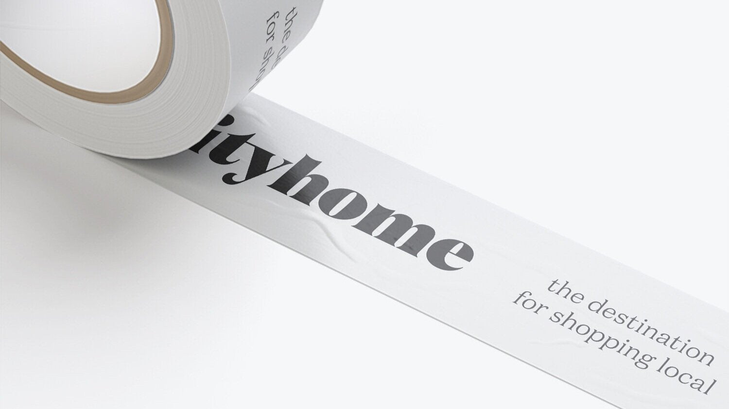
Overall, with so many lifestyle-focused brands sitting under the Cityhome umbrella we needed to create a coherent brand identity that could sit with multiple other lifestyle brand identities. The brand needed to have the feeling of support and warmth to customers using the service.
The logotype is a display serif font, holding a sense of familiarity, and the bespoke curved tops of the letterforms feel soft and welcoming. The i, h and m particularly have a supporting feel, holding the letters and shapes that sit above them - giving a connected and supportive feel to the identity.
We created a brand palette that felt natural for online elements and packaging materials are printed on recycled and sustainable stocks with a black and white palette to keep printing minimal and sustainable.
I can’t wait to see what is next for Cityhome, and hope to be involved as the brand develops too."

We look forward to continuing to work with Beth on our visual identity and brand assets! If you would like to check out more of her work, we encourage you to visit her website or pop her a note on instagram!
bethsalter.com
